AI的提示词专栏:前端 UI 生成 Prompt,HTML/CSS/JS 教程


AI的提示词专栏:前端 UI 生成 Prompt,HTML/CSS/JS 教程
本文围绕前端 UI 生成 Prompt 展开,先阐述其关联价值,即解决前端开发中 “需求描述→代码转化” 的效率瓶颈,提升效率、降低门槛并实现标准化输出。接着介绍核心设计原则,包括明确 UI 功能定位与视觉风格、指定技术栈与兼容性要求等六大原则。随后提供五大场景化示例,涵盖静态响应式博客首页、电商 “加入购物车” 组件等,每个示例含 Prompt 设计、生成代码及技巧点分析。还给出优化技巧,如分层描述需求、明确技术栈版本等,以及常见问题解决方案,最后总结核心要点,指出当前需 “精准 Prompt + 人工微调”,并展望未来发展方向。
人工智能专栏介绍
人工智能学习合集专栏是 AI 学习者的实用工具。它像一个全面的 AI 知识库,把提示词设计、AI 创作、智能绘图等多个细分领域的知识整合起来。无论你是刚接触 AI 的新手,还是有一定基础想提升的人,都能在这里找到合适的内容。从最基础的工具操作方法,到背后深层的技术原理,专栏都有讲解,还搭配了实例教程和实战案例。这些内容能帮助学习者一步步搭建完整的 AI 知识体系,让大家快速从入门进步到精通,更好地应对学习和工作中遇到的 AI 相关问题。

这个系列专栏能教会人们很多实用的 AI 技能。在提示词方面,能让人学会设计精准的提示词,用不同行业的模板高效和 AI 沟通。写作上,掌握从选题到成稿的全流程技巧,用 AI 辅助写出高质量文本。编程时,借助 AI 完成代码编写、调试等工作,提升开发速度。绘图领域,学会用 AI 生成符合需求的设计图和图表。此外,还能了解主流 AI 工具的用法,学会搭建简单智能体,掌握大模型的部署和应用开发等技能,覆盖多个场景,满足不同学习者的需求。

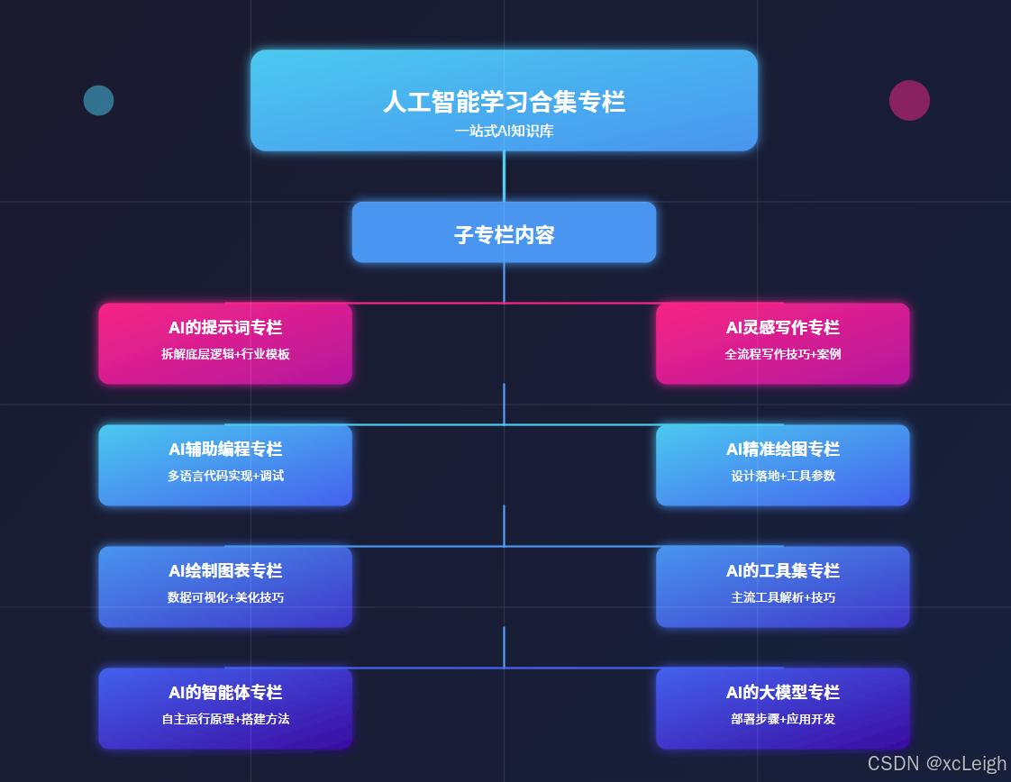
1️⃣ ⚡ 点击进入 AI 的提示词专栏,专栏拆解提示词底层逻辑,从明确指令到场景化描述,教你精准传递需求。还附带包含各行业适配模板:医疗问诊话术、电商文案指令等,附优化技巧,让 AI 输出更贴合预期,提升工作效率。
2️⃣ ⚡ 点击进入 AI 灵感写作专栏,AI 灵感写作专栏,从选题到成稿,全流程解析 AI 写作技巧。涵盖论文框架搭建、小说情节生成等,教你用提示词引导 AI 输出内容,再进行人工润色。附不同文体案例,助你解决写作卡壳,产出高质量文本。
3️⃣ ⚡ 点击进入 AI 辅助编程专栏,AI 辅助编程专栏,通过实例教你用 AI 写代码:从功能描述到调试优化。涵盖前端、后端、数据库等,语言包括HTML5、VUE、Python、Java、C# 等语言,含算法实现、Bug 修复技巧,帮开发者减少重复劳动,专注核心逻辑,提升开发速度。
4️⃣ ⚡ 点击进入 AI 精准绘图专栏,AI 精准绘图,聚焦 AI 绘图在设计场景的落地。详解如何描述风格、元素、用途,生成 logo、商标等。含 Midjourney 等工具参数设置,及修改迭代方法,帮设计新手快速出图,满足商业与个人需求。
5️⃣ ⚡ 点击进入 AI 绘制图表专栏,AI 绘制图表专栏,教你用 AI 工具将数据转化为直观图表。涵盖曲线图数据输入、流程图逻辑梳理等,附 Excel 联动、格式美化技巧,适合学生、职场人快速制作专业图表,提升数据展示效果。
6️⃣ ⚡ 点击进入 AI 的工具集专栏,AI 的工具集专栏,盘点主流 AI 工具:ChatGPT、DeepSeek、 Claude、Gemini、Copilot 等。解析各工具优势,附使用场景与技巧,帮你根据需求选工具,快速上手提升效率,覆盖办公、创作、开发等场景。
7️⃣ ⚡ 点击进入 AI 的智能体专栏,AI 的智能体专栏,解析智能体自主运行原理,包括任务拆解、环境交互等。教你用大模型搭建简单智能体,附多智能体协作案例,适合想探索 AI 自主系统的开发者入门。
8️⃣ ⚡ 点击进入 AI 的大模型专栏,AI 的大模型专栏,详解大模型部署步骤,从本地搭建到云端部署。含 API 调用教程、应用开发案例,教你将大模型集成到项目,掌握企业级 AI 应用开发技能,应对实际业务需求。
一、引言:前端UI生成与Prompt的关联价值
在前端开发领域,UI实现往往面临“需求描述→代码转化”的效率瓶颈——设计师的视觉稿需开发者逐行编码还原,简单页面的结构搭建、样式调试也可能消耗数小时。而大语言模型(LLM)通过Prompt驱动的UI生成,能将自然语言描述直接转化为可运行的HTML/CSS/JS代码,大幅缩短开发周期。
这种方式的核心价值体现在三个维度:
- 效率提升:对原型验证、小型项目或个人开发者,省去“拆解设计稿→编写基础代码”的重复工作,聚焦交互逻辑等核心需求;
- 降低门槛:非专业前端开发者(如产品经理、设计师)可通过自然语言生成基础UI,快速验证想法;
- 标准化输出:通过Prompt约束代码风格(如命名规范、兼容性要求),确保生成的HTML结构语义化、CSS样式可维护。
本文将从“Prompt设计原则→场景化示例→优化技巧”三个层面,系统讲解如何通过Prompt生成高质量前端UI代码,覆盖静态页面、交互组件、响应式布局等核心场景。
二、前端UI生成Prompt的核心设计原则
要让LLM生成符合预期的前端代码,Prompt需精准传递“需求目标、技术约束、输出格式”三大核心信息,避免语义模糊导致的代码偏差。以下是6条必须遵循的设计原则:
(一)明确UI的“功能定位”与“视觉风格”
LLM无法默认理解UI的使用场景(如“后台管理系统按钮”vs“电商商品卡片”),需在Prompt中明确:
- 功能定位:该UI组件的用途(如“用户登录表单”“商品列表卡片”“导航菜单”)、核心交互(如“点击按钮显示弹窗”“ hover时显示详情”);
- 视觉风格:整体风格(极简、拟物、扁平化、暗黑模式)、色彩要求(如“主色调#165DFF,辅助色#36CFC9”)、字体规范(如“正文用14px Microsoft YaHei,标题用18px bold”)。
反例:“帮我写一个按钮的HTML/CSS代码”(未明确用途、风格,生成的按钮可能不符合场景);
正例:“帮我生成电商详情页的‘加入购物车’按钮代码,功能:点击后显示‘添加成功’提示;风格:扁平化,主色#FF4400,hover时背景色#CC3300,字体16px 微软雅黑,按钮圆角8px”。
(二)指定技术栈与兼容性要求
前端技术存在多版本、多框架差异(如CSS的Flex/Grid布局、JS的原生DOM操作vs Vue/React语法),需在Prompt中明确:
- 基础技术:HTML版本(如HTML5)、CSS预处理器(如原生CSS、Sass)、JS框架(如原生JS、Vue2、React18);
- 兼容性:需支持的浏览器(如“兼容Chrome 90+、Edge 90+、移动端Safari 14+”)、响应式断点(如“移动端<768px,平板768px-1024px,桌面>1024px”)。
示例:“生成响应式导航栏代码,技术栈:HTML5+原生CSS+原生JS;兼容Chrome 88+、移动端Safari 13+;响应式断点:768px(移动端隐藏菜单,显示汉堡按钮;桌面端显示完整菜单)”。
(三)约束代码结构与命名规范
为保证生成代码的可维护性,需在Prompt中定义代码结构和命名规则:
- 结构要求:如“HTML需包含header、main、footer标签,CSS需按‘重置样式→公共样式→组件样式’分类,JS代码需封装为函数”;
- 命名规范:如“CSS类名用BEM命名法(如‘btn–primary’‘card__title’),JS变量用小驼峰命名(如‘showToast’)”。
示例:“生成用户信息卡片代码,代码要求:1. HTML结构包含.card容器,内部有.card__avatar(头像)、.card__info(信息区)、.card__action(操作按钮区);2. CSS用BEM命名,不使用内联样式;3. JS实现‘点击编辑按钮切换信息可编辑状态’的功能,函数名命名为toggleEditMode”。
(四)包含“输入输出”的明确格式
为避免LLM返回冗余内容(如代码解释文字过多),需在Prompt中指定:
- 输入:是否需要传入动态数据(如“商品卡片需预留{productName}、{price}、{imgUrl}三个变量,用于后续数据渲染”);
- 输出:代码的组织形式(如“按‘HTML代码→CSS代码→JS代码’分段输出,每段代码前标注标题,无需额外解释”)。
示例:“生成待办事项列表组件代码,输出要求:1. 先输出HTML代码(包含待办输入框、待办列表容器),再输出CSS代码(美化列表项、完成状态样式),最后输出JS代码(实现‘添加待办’‘标记完成’‘删除待办’功能);2. JS代码中预留addTodo、toggleTodo、deleteTodo三个函数,便于后续扩展;3. 无需额外文字解释,仅输出代码”。
(五)补充“边界条件”与“异常处理”
对包含交互的UI组件,需提前考虑边界场景,避免生成的代码存在bug:
- 边界条件:如“输入框为空时点击‘添加’按钮,需提示‘请输入内容’”“列表为空时显示‘暂无数据’提示”;
- 异常处理:如“图片加载失败时,显示默认占位图(src设为‘./default-avatar.png’)”“按钮点击后防止重复触发(添加loading状态)”。
示例:“生成图片上传预览组件代码,功能:选择本地图片后预览,支持删除预览图;边界处理:1. 仅允许上传jpg/png格式图片,选择其他格式时提示‘请选择正确的图片格式’;2. 图片大小超过2MB时提示‘图片大小不能超过2MB’;3. 预览图加载失败时显示‘./error-img.png’占位图”。
(六)善用“参考示例”降低理解成本
若UI需求较复杂(如“仿某网站的导航栏交互”),可在Prompt中加入简单参考示例,帮助LLM对齐预期:
- 参考样式:如“视觉风格参考小红书移动端的卡片设计,圆角12px,阴影用rgba(0,0,0,0.05),间距8px”;
- 参考交互:如“点击下拉菜单的逻辑参考Element UI的Select组件,点击外部关闭菜单,支持键盘上下键选择选项”。
示例:“生成仿微信PC端的聊天输入框组件,参考要求:1. 样式参考微信PC端,输入框高度40px,边框圆角6px,发送按钮为绿色(#07C160);2. 交互参考:输入内容为空时发送按钮禁用,输入时显示‘发送’文字,按Enter键可快捷发送,支持粘贴图片预览”。
三、场景化前端UI生成Prompt示例(含代码与分析)
以下针对前端开发中最常见的5类场景,提供完整的“Prompt→生成代码→技巧点分析”,覆盖静态页面、交互组件、响应式布局等核心需求,所有代码可直接复制运行。
场景1:静态响应式博客首页(HTML+CSS)
1. Prompt设计
请生成一个响应式博客首页的HTML和CSS代码,需求如下:
1. 功能定位:个人博客首页,包含头部(导航栏)、banner区(博客标题+副标题)、文章列表区、侧边栏(作者信息+热门标签)、底部(版权信息);
2. 视觉风格:极简风,主色调#2D3748(深灰蓝),辅助色#4299E1(浅蓝),背景色#F7FAFC,字体用系统默认无衬线字体(fallback为sans-serif);
3. 技术要求:HTML5语义化标签,原生CSS,使用Flex和Grid布局,不依赖任何框架;
4. 响应式规则:
   - 桌面端(>1024px):文章列表区与侧边栏并排(列表占70%,侧边栏占30%),导航栏显示完整菜单;
   - 平板端(768px-1024px):文章列表区与侧边栏并排(列表占65%,侧边栏占35%),导航栏显示简化菜单;
   - 移动端(<768px):文章列表区与侧边栏上下排列(侧边栏在文章列表下方),导航栏隐藏菜单,显示汉堡按钮(点击展开菜单,暂不实现JS交互,仅做样式);
5. 代码规范:CSS按“重置样式→公共样式→组件样式→响应式样式”分类,类名用小写字母+横杠分隔(如“blog-header”);
6. 输出格式:先输出HTML代码,再输出CSS代码,每段代码前标注标题,无需额外解释。
2. 生成代码
(1)HTML代码
<!DOCTYPE html>
<html lang="zh-CN">
<head>
<meta charset="UTF-8">
<meta name="viewport" content="width=device-width, initial-scale=1.0">
<title>极简个人博客</title>
<link rel="stylesheet" href="style.css">
<!-- 引入图标库(用于汉堡按钮和标签) -->
<link rel="stylesheet" href="https://cdn.jsdelivr.net/npm/font-awesome@4.7.0/css/font-awesome.min.css">
</head>
<body>
<!-- 头部导航 -->
<header class="blog-header">
<div class="container">
<div class="logo">
<a href="#">极简博客</a>
</div>
<!-- 桌面端菜单 -->
<nav class="desktop-nav">
<ul>
<li><a href="#" class="active">首页</a></li>
<li><a href="#">文章</a></li>
<li><a href="#">分类</a></li>
<li><a href="#">关于我</a></li>
</ul>
</nav>
<!-- 移动端汉堡按钮 -->
<div class="mobile-hamburger">
<i class="fa fa-bars"></i>
</div>
<!-- 移动端菜单(默认隐藏) -->
<nav class="mobile-nav">
<ul>
<li><a href="#" class="active">首页</a></li>
<li><a href="#">文章</a></li>
<li><a href="#">分类</a></li>
<li><a href="#">关于我</a></li>
</ul>
</nav>
</div>
</header>
<!-- Banner区 -->
<section class="blog-banner">
<div class="container">
<h1>记录技术与生活的思考</h1>
<p>专注前端开发、AI应用与效率工具分享</p>
</div>
</section>
<!-- 主内容区 -->
<main class="blog-main">
<div class="container">
<div class="content-wrapper">
<!-- 文章列表区 -->
<section class="article-list">
<h2 class="section-title">最新文章</h2>
<!-- 文章卡片1 -->
<article class="article-card">
<div class="card-img">
<img src="https://picsum.photos/id/24/800/400" alt="前端性能优化">
</div>
<div class="card-content">
<h3 class="card-title"><a href="#">2024年前端性能优化实战指南:从加载到渲染</a></h3>
<div class="card-meta">
<span><i class="fa fa-calendar"></i> 2024-05-10</span>
<span><i class="fa fa-folder"></i> 前端开发</span>
<span><i class="fa fa-eye"></i> 1289</span>
</div>
<p class="card-excerpt">本文从资源加载、代码执行、页面渲染三个维度,总结10个可落地的性能优化技巧,包含LCP优化、懒加载实现、CSS阻塞解决等实战案例...</p>
<a href="#" class="read-more">阅读更多 <i class="fa fa-angle-right"></i></a>
</div>
</article>
<!-- 文章卡片2 -->
<article class="article-card">
<div class="card-img">
<img src="https://picsum.photos/id/48/800/400" alt="Prompt工程">
</div>
<div class="card-content">
<h3 class="card-title"><a href="#">用Prompt生成前端代码:效率提升10倍的技巧</a></h3>
<div class="card-meta">
<span><i class="fa fa-calendar"></i> 2024-04-25</span>
<span><i class="fa fa-folder"></i> AI应用</span>
<span><i class="fa fa-eye"></i> 956</span>
</div>
<p class="card-excerpt">如何通过精准的Prompt让LLM生成符合需求的前端代码?本文结合实际案例,讲解Prompt的结构设计、技术约束传递、兼容性要求定义等核心要点...</p>
<a href="#" class="read-more">阅读更多 <i class="fa fa-angle-right"></i></a>
</div>
</article>
<!-- 文章卡片3 -->
<article class="article-card">
<div class="card-img">
<img src="https://picsum.photos/id/160/800/400" alt="响应式设计">
</div>
<div class="card-content">
<h3 class="card-title"><a href="#">响应式布局避坑指南:从像素到适配逻辑</a></h3>
<div class="card-meta">
<span><i class="fa fa-calendar"></i> 2024-03-18</span>
<span><i class="fa fa-folder"></i> 前端开发</span>
<span><i class="fa fa-eye"></i> 723</span>
</div>
<p class="card-excerpt">响应式布局不是简单的媒体查询堆砌!本文分析常见的适配问题(如元素错位、字体溢出),并提供Flex+Grid混合布局、vw单位使用等解决方案...</p>
<a href="#" class="read-more">阅读更多 <i class="fa fa-angle-right"></i></a>
</div>
</article>
</section>
<!-- 侧边栏 -->
<aside class="blog-sidebar">
<!-- 作者信息 -->
<div class="sidebar-widget author-widget">
<h3 class="widget-title">关于作者</h3>
<div class="author-avatar">
<img src="https://picsum.photos/id/64/100/100" alt="作者头像">
</div>
<div class="author-info">
<h4>前端开发工程师</h4>
<p>5年前端开发经验,专注于高性能前端架构与AI工具整合</p>
</div>
<div class="author-social">
<a href="#"><i class="fa fa-github"></i></a>
<a href="#"><i class="fa fa-weibo"></i></a>
<a href="#"><i class="fa fa-linkedin"></i></a>
</div>
</div>
<!-- 热门标签 -->
<div class="sidebar-widget tags-widget">
<h3 class="widget-title">热门标签</h3>
<div class="tags-list">
<a href="#">前端开发</a>
<a href="#">Prompt工程</a>
<a href="#">性能优化</a>
<a href="#">响应式设计</a>
<a href="#">AI工具</a>
<a href="#">JavaScript</a>
<a href="#">CSS</a>
<a href="#">HTML5</a>
</div>
</div>
<!-- 推荐文章 -->
<div class="sidebar-widget recommend-widget">
<h3 class="widget-title">推荐阅读</h3>
<ul class="recommend-list">
<li><a href="#">CSS Grid布局实战:3种常见页面结构实现</a></li>
<li><a href="#">JavaScript异步编程:从Promise到Async/Await</a></li>
<li><a href="#">用AI工具提升前端开发效率:5款必备工具</a></li>
</ul>
</div>
</aside>
</div>
</div>
</main>
<!-- 底部 -->
<footer class="blog-footer">
<div class="container">
<p>© 2024 极简个人博客 | 保留所有权利</p>
</div>
</footer>
</body>
</html>
(2)CSS代码
/* 1. 重置样式 */
* {
    margin: 0;
    padding: 0;
    box-sizing: border-box;
}
body {
    font-family: -apple-system, BlinkMacSystemFont, "Segoe UI", Roboto, "Helvetica Neue", Arial, sans-serif;
    font-size: 16px;
    line-height: 1.5;
    color: #2D3748;
    background-color: #F7FAFC;
}
ul {
    list-style: none;
}
a {
    text-decoration: none;
    color: inherit;
}
img {
    max-width: 100%;
    height: auto;
    display: block;
}
h1, h2, h3, h4 {
    line-height: 1.2;
    margin-bottom: 0.5rem;
}
/* 2. 公共样式 */
.container {
    width: 100%;
    max-width: 1200px;
    margin: 0 auto;
    padding: 0 1rem;
}
.section-title {
    font-size: 1.5rem;
    font-weight: 600;
    margin-bottom: 1.5rem;
    padding-bottom: 0.5rem;
    border-bottom: 2px solid #4299E1;
}
.widget-title {
    font-size: 1.2rem;
    font-weight: 600;
    margin-bottom: 1rem;
    padding-left: 0.5rem;
    border-left: 3px solid #4299E1;
}
/* 3. 组件样式 - 头部导航 */
.blog-header {
    background-color: #fff;
    box-shadow: 0 2px 4px rgba(0, 0, 0, 0.05);
    padding: 1rem 0;
    position: sticky;
    top: 0;
    z-index: 100;
}
.blog-header .container {
    display: flex;
    justify-content: space-between;
    align-items: center;
}
.logo a {
    font-size: 1.5rem;
    font-weight: 700;
    color: #2D3748;
}
/* 桌面端导航 */
.desktop-nav ul {
    display: flex;
    gap: 2rem;
}
.desktop-nav a {
    font-size: 1rem;
    color: #4A5568;
    transition: color 0.3s;
}
.desktop-nav a.active,
.desktop-nav a:hover {
    color: #4299E1;
    font-weight: 500;
}
/* 移动端汉堡按钮 */
.mobile-hamburger {
    font-size: 1.5rem;
    color: #2D3748;
    cursor: pointer;
    display: none;
}
/* 移动端导航 */
.mobile-nav {
    position: absolute;
    top: 100%;
    left: 0;
    width: 100%;
    background-color: #fff;
    box-shadow: 0 2px 4px rgba(0, 0, 0, 0.05);
    padding: 1rem 0;
    display: none;
}
.mobile-nav ul {
    display: flex;
    flex-direction: column;
    gap: 1rem;
    align-items: center;
}
.mobile-nav a {
    font-size: 1rem;
    color: #4A5568;
}
.mobile-nav a.active {
    color: #4299E1;
    font-weight: 500;
}
/* 4. 组件样式 - Banner区 */
.blog-banner {
    background-color: #2D3748;
    color: #fff;
    text-align: center;
    padding: 4rem 0;
    margin-bottom: 2rem;
}
.blog-banner h1 {
    font-size: 2.5rem;
    margin-bottom: 1rem;
}
.blog-banner p {
    font-size: 1.2rem;
    opacity: 0.9;
}
/* 5. 组件样式 - 主内容区 */
.blog-main {
    padding: 2rem 0;
}
.content-wrapper {
    display: flex;
    gap: 2rem;
}
/* 文章列表区 */
.article-list {
    flex: 7;
}
.article-card {
    background-color: #fff;
    border-radius: 8px;
    box-shadow: 0 2px 8px rgba(0, 0, 0, 0.05);
    margin-bottom: 2rem;
    overflow: hidden;
    display: flex;
    flex-direction: column;
}
@media (min-width: 768px) {
    .article-card {
        flex-direction: row;
    }
}
.article-card .card-img {
    flex: 4;
}
.article-card .card-img img {
    width: 100%;
    height: 100%;
    object-fit: cover;
}
.article-card .card-content {
    flex: 6;
    padding: 1.5rem;
}
.card-title {
    font-size: 1.3rem;
    margin-bottom: 0.5rem;
}
.card-title a {
    color: #2D3748;
    transition: color 0.3s;
}
.card-title a:hover {
    color: #4299E1;
}
.card-meta {
    font-size: 0.9rem;
    color: #718096;
    margin-bottom: 1rem;
    display: flex;
    gap: 1rem;
}
.card-excerpt {
    font-size: 1rem;
    color: #4A5568;
    margin-bottom: 1rem;
    display: -webkit-box;
    -webkit-line-clamp: 3;
    -webkit-box-orient: vertical;
    overflow: hidden;
}
.read-more {
    display: inline-block;
    font-size: 0.95rem;
    color: #4299E1;
    font-weight: 500;
    transition: color 0.3s;
}
.read-more:hover {
    color: #2B6CB0;
}
/* 侧边栏 */
.blog-sidebar {
    flex: 3;
}
.sidebar-widget {
    background-color: #fff;
    border-radius: 8px;
    box-shadow: 0 2px 8px rgba(0, 0, 0, 0.05);
    padding: 1.5rem;
    margin-bottom: 2rem;
}
/* 作者信息组件 */
.author-avatar {
    width: 80px;
    height: 80px;
    border-radius: 50%;
    overflow: hidden;
    margin: 0 auto 1rem;
}
.author-info h4 {
    font-size: 1.1rem;
    text-align: center;
    margin-bottom: 0.5rem;
}
.author-info p {
    font-size: 0.9rem;
    color: #718096;
    text-align: center;
    margin-bottom: 1rem;
}
.author-social {
    display: flex;
    justify-content: center;
    gap: 1rem;
    font-size: 1.2rem;
    color: #4A5568;
}
.author-social a:hover {
    color: #4299E1;
}
/* 热门标签组件 */
.tags-list {
    display: flex;
    flex-wrap: wrap;
    gap: 0.8rem;
}
.tags-list a {
    display: inline-block;
    padding: 0.4rem 0.8rem;
    background-color: #F7FAFC;
    border-radius: 20px;
    font-size: 0.9rem;
    color: #4A5568;
    transition: all 0.3s;
}
.tags-list a:hover {
    background-color: #4299E1;
    color: #fff;
}
/* 推荐文章组件 */
.recommend-list {
    display: flex;
    flex-direction: column;
    gap: 1rem;
}
.recommend-list li a {
    font-size: 0.95rem;
    color: #4A5568;
    transition: color 0.3s;
    display: -webkit-box;
    -webkit-line-clamp: 2;
    -webkit-box-orient: vertical;
    overflow: hidden;
}
.recommend-list li a:hover {
    color: #4299E1;
    padding-left: 0.5rem;
}
/* 6. 组件样式 - 底部 */
.blog-footer {
    background-color: #2D3748;
    color: #fff;
    text-align: center;
    padding: 2rem 0;
    margin-top: 2rem;
}
.blog-footer p {
    font-size: 0.95rem;
    opacity: 0.9;
}
/* 7. 响应式样式 */
@media (max-width: 1024px) {
    .content-wrapper {
        gap: 1.5rem;
    }
}
@media (max-width: 768px) {
    /* 导航栏 */
    .desktop-nav {
        display: none;
    }
    .mobile-hamburger {
        display: block;
    }
    /* 主内容区 */
    .content-wrapper {
        flex-direction: column;
    }
    .article-card {
        flex-direction: column;
    }
    .article-card .card-img {
        height: 200px;
    }
    /* Banner区 */
    .blog-banner h1 {
        font-size: 2rem;
    }
    .blog-banner p {
        font-size: 1rem;
    }
}
@media (max-width: 480px) {
    .blog-banner {
        padding: 2.5rem 0;
    }
    .blog-banner h1 {
        font-size: 1.8rem;
    }
    .card-meta {
        flex-wrap: wrap;
        gap: 0.5rem;
    }
}
(3)运行效果
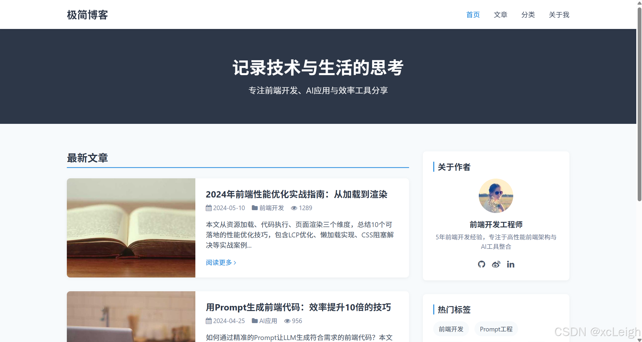
3. 技巧点分析
-
语义化结构传递:Prompt中明确要求“使用HTML5语义化标签”,生成的代码包含
<header>``<main>``<section>``<aside>``<footer>,符合前端开发规范,便于SEO和维护; -
响应式逻辑落地:Prompt定义了三级断点(移动端<768px、平板768px-1024px、桌面>1024px),生成的CSS通过
@media查询实现“移动端菜单隐藏/显示”“文章卡片横竖布局切换”,完全匹配需求; - 样式分类清晰:Prompt要求CSS按“重置→公共→组件→响应式”分类,生成的代码严格遵循该结构,避免样式混乱,后续修改(如调整主色调)只需修改公共样式中的变量即可。
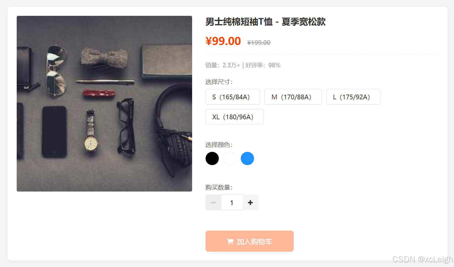
场景2:交互型商品详情页“加入购物车”组件(HTML+CSS+JS)
1. Prompt设计
请生成电商商品详情页的“加入购物车”组件代码,需求如下:
1. 功能定位:商品规格选择(尺寸、颜色)+ 数量调整 + 加入购物车,包含交互反馈(如规格未选提示、添加成功弹窗);
2. 视觉风格:电商风格,主色#FF4400(橙色),按钮hover时背景色#CC3300,边框圆角6px,阴影用rgba(255,68,0,0.1);
3. 技术要求:HTML5+原生CSS+原生JS,不依赖框架,JS需封装为函数,避免全局变量污染;
4. 核心交互逻辑:
   - 规格选择:尺寸(S/M/L/XL)和颜色(黑色/白色/蓝色)需同时选中,未选中时“加入购物车”按钮禁用(灰色);
   - 数量调整:支持“+/-”按钮增减数量,最小1件,最大10件,输入框手动输入时自动校验(非数字/超范围则重置为1);
   - 加入购物车:点击后显示“添加成功”弹窗(3秒后自动关闭),同时重置规格选择和数量;
   - 异常处理:未选规格点击按钮时,显示“请选择尺寸和颜色”提示;数量输入非数字时,显示“请输入有效数量”提示;
5. 代码规范:CSS类名用BEM命名法(如“cart-btn”“spec__item”),JS函数名用小驼峰(如“handleSpecSelect”);
6. 输出格式:按“HTML代码→CSS代码→JS代码”分段输出,每段代码前标注标题,无需额外解释。
2. 生成代码
(1)HTML代码
<!DOCTYPE html>
<html lang="zh-CN">
<head>
    <meta charset="UTF-8">
    <meta name="viewport" content="width=device-width, initial-scale=1.0">
    <title>商品详情页 - 加入购物车组件</title>
    <link rel="stylesheet" href="style.css">
    <link rel="stylesheet" href="https://cdn.jsdelivr.net/npm/font-awesome@4.7.0/css/font-awesome.min.css">
</head>
<body>
    <!-- 商品信息容器 -->
    <div class="product-container">
        <!-- 商品图片(简化) -->
        <div class="product-img">
            <img src="https://picsum.photos/id/26/400/400" alt="男士纯棉T恤">
        </div>
        <!-- 商品信息与加入购物车组件 -->
        <div class="product-info">
            <h1 class="product__title">男士纯棉短袖T恤 - 夏季宽松款</h1>
            <div class="product__price">
                <span class="price__current">¥99.00</span>
                <span class="price__original">¥199.00</span>
            </div>
            <div class="product__sales">销量:2.3万+ | 好评率:98%</div>
            <!-- 规格选择区 -->
            <div class="spec__group">
                <!-- 尺寸选择 -->
                <div class="spec__item">
                    <label class="spec__label">选择尺寸:</label>
                    <div class="spec__options" id="sizeOptions">
                        <span class="spec__option" data-value="S">S(165/84A)</span>
                        <span class="spec__option" data-value="M">M(170/88A)</span>
                        <span class="spec__option" data-value="L">L(175/92A)</span>
                        <span class="spec__option" data-value="XL">XL(180/96A)</span>
                    </div>
                    <div class="spec__tip" id="sizeTip"></div>
                </div>
                <!-- 颜色选择 -->
                <div class="spec__item">
                    <label class="spec__label">选择颜色:</label>
                    <div class="spec__options" id="colorOptions">
                        <span class="spec__option" data-value="black" style="background-color: #000;"></span>
                        <span class="spec__option" data-value="white" style="background-color: #fff; border: 1px solid #eee;"></span>
                        <span class="spec__option" data-value="blue" style="background-color: #1E90FF;"></span>
                    </div>
                    <div class="spec__tip" id="colorTip"></div>
                </div>
            </div>
            <!-- 数量调整区 -->
            <div class="quantity__group">
                <label class="quantity__label">购买数量:</label>
                <div class="quantity__control">
                    <button class="quantity__btn minus-btn" id="minusBtn" disabled><i class="fa fa-minus"></i></button>
                    <input type="text" class="quantity__input" id="quantityInput" value="1" min="1" max="10">
                    <button class="quantity__btn plus-btn" id="plusBtn"><i class="fa fa-plus"></i></button>
                </div>
                <div class="quantity__tip" id="quantityTip"></div>
            </div>
            <!-- 加入购物车按钮 -->
            <div class="cart__group">
                <button class="cart__btn" id="addToCartBtn" disabled>
                    <i class="fa fa-shopping-cart"></i> 加入购物车
                </button>
            </div>
        </div>
    </div>
    <!-- 添加成功弹窗(默认隐藏) -->
    <div class="toast" id="successToast">
        <i class="fa fa-check-circle"></i>
        <span>添加成功!商品已加入购物车</span>
    </div>
    <script src="script.js"></script>
</body>
</html>
(2)CSS代码
/* 1. 重置样式 */
* {
    margin: 0;
    padding: 0;
    box-sizing: border-box;
}
body {
    font-family: "Microsoft YaHei", Arial, sans-serif;
    font-size: 14px;
    color: #333;
    background-color: #f5f5f5;
    padding: 20px;
}
button {
    border: none;
    outline: none;
    cursor: pointer;
    font-family: inherit;
    font-size: inherit;
}
input {
    border: 1px solid #ddd;
    outline: none;
    font-family: inherit;
    font-size: inherit;
}
/* 2. 公共样式 */
.toast {
    position: fixed;
    top: 50%;
    left: 50%;
    transform: translate(-50%, -50%);
    background-color: rgba(0, 0, 0, 0.8);
    color: #fff;
    padding: 12px 24px;
    border-radius: 4px;
    display: flex;
    align-items: center;
    gap: 8px;
    font-size: 14px;
    z-index: 1000;
    opacity: 0;
    visibility: hidden;
    transition: all 0.3s;
}
.toast.show {
    opacity: 1;
    visibility: visible;
}
.toast i {
    color: #4CAF50;
    font-size: 18px;
}
/* 3. 组件样式 - 商品容器 */
.product-container {
    display: flex;
    gap: 30px;
    max-width: 1000px;
    margin: 0 auto;
    background-color: #fff;
    padding: 20px;
    border-radius: 8px;
    box-shadow: 0 2px 8px rgba(0, 0, 0, 0.05);
}
.product-img {
    width: 400px;
    height: 400px;
    border: 1px solid #f0f0f0;
    border-radius: 4px;
    overflow: hidden;
}
.product-img img {
    width: 100%;
    height: 100%;
    object-fit: cover;
}
.product-info {
    flex: 1;
}
/* 4. 组件样式 - 商品基础信息 */
.product__title {
    font-size: 20px;
    color: #333;
    margin-bottom: 15px;
    line-height: 1.3;
}
.product__price {
    margin-bottom: 15px;
    padding-bottom: 15px;
    border-bottom: 1px dashed #eee;
}
.price__current {
    font-size: 24px;
    color: #FF4400;
    font-weight: bold;
    margin-right: 10px;
}
.price__original {
    font-size: 14px;
    color: #999;
    text-decoration: line-through;
}
.product__sales {
    font-size: 13px;
    color: #999;
    margin-bottom: 20px;
}
/* 5. 组件样式 - 规格选择(BEM命名) */
.spec__group {
    margin-bottom: 20px;
}
.spec__item {
    margin-bottom: 15px;
}
.spec__label {
    display: block;
    font-size: 14px;
    color: #666;
    margin-bottom: 8px;
}
.spec__options {
    display: flex;
    gap: 10px;
    flex-wrap: wrap;
}
/* 尺寸规格选项 */
#sizeOptions .spec__option {
    display: inline-block;
    padding: 8px 15px;
    border: 1px solid #ddd;
    border-radius: 4px;
    cursor: pointer;
    transition: all 0.2s;
}
#sizeOptions .spec__option:hover {
    border-color: #FF4400;
}
#sizeOptions .spec__option.active {
    border-color: #FF4400;
    background-color: rgba(255, 68, 0, 0.05);
    color: #FF4400;
    font-weight: 500;
}
/* 颜色规格选项 */
#colorOptions .spec__option {
    width: 30px;
    height: 30px;
    border-radius: 50%;
    cursor: pointer;
    transition: all 0.2s;
}
#colorOptions .spec__option:hover {
    box-shadow: 0 0 0 2px rgba(255, 68, 0, 0.3);
}
#colorOptions .spec__option.active {
    box-shadow: 0 0 0 2px rgba(255, 68, 0, 0.5);
}
.spec__tip {
    font-size: 12px;
    color: #FF4400;
    margin-top: 5px;
    height: 16px; /* 固定高度,避免布局跳动 */
}
/* 6. 组件样式 - 数量调整(BEM命名) */
.quantity__group {
    margin-bottom: 25px;
}
.quantity__label {
    display: block;
    font-size: 14px;
    color: #666;
    margin-bottom: 8px;
}
.quantity__control {
    display: flex;
    align-items: center;
    width: 120px;
}
.quantity__btn {
    width: 36px;
    height: 36px;
    background-color: #f5f5f5;
    color: #333;
    border-radius: 4px 0 0 4px;
    transition: background-color 0.2s;
}
.quantity__btn.plus-btn {
    border-radius: 0 4px 4px 0;
}
.quantity__btn:disabled {
    background-color: #eee;
    color: #ccc;
    cursor: not-allowed;
}
.quantity__btn:not(:disabled):hover {
    background-color: #eee;
}
.quantity__input {
    width: 48px;
    height: 36px;
    text-align: center;
    border-left: none;
    border-right: none;
    border-radius: 0;
}
.quantity__tip {
    font-size: 12px;
    color: #FF4400;
    margin-top: 5px;
    height: 16px;
}
/* 7. 组件样式 - 加入购物车按钮(BEM命名) */
.cart__btn {
    width: 200px;
    height: 48px;
    background-color: #FF4400;
    color: #fff;
    font-size: 16px;
    border-radius: 6px;
    display: flex;
    align-items: center;
    justify-content: center;
    gap: 8px;
    transition: background-color 0.2s;
}
.cart__btn:disabled {
    background-color: #ffb899;
    cursor: not-allowed;
}
.cart__btn:not(:disabled):hover {
    background-color: #CC3300;
}
/* 8. 响应式样式 */
@media (max-width: 768px) {
    .product-container {
        flex-direction: column;
    }
    .product-img {
        width: 100%;
        height: auto;
    }
    .cart__btn {
        width: 100%;
    }
}
(3)JS代码
// 全局状态管理(封装为对象,避免全局变量污染)
const cartState = {
    selectedSize: '', // 选中的尺寸
    selectedColor: '', // 选中的颜色
    quantity: 1, // 购买数量
    maxQuantity: 10, // 最大数量
    minQuantity: 1 // 最小数量
};
// DOM元素获取
const sizeOptions = document.getElementById('sizeOptions');
const colorOptions = document.getElementById('colorOptions');
const minusBtn = document.getElementById('minusBtn');
const plusBtn = document.getElementById('plusBtn');
const quantityInput = document.getElementById('quantityInput');
const addToCartBtn = document.getElementById('addToCartBtn');
const sizeTip = document.getElementById('sizeTip');
const colorTip = document.getElementById('colorTip');
const quantityTip = document.getElementById('quantityTip');
const successToast = document.getElementById('successToast');
// 初始化事件监听
function initEventListeners() {
    // 尺寸选择事件
    sizeOptions.addEventListener('click', handleSpecSelect);
    // 颜色选择事件
    colorOptions.addEventListener('click', handleSpecSelect);
    // 数量减少按钮事件
    minusBtn.addEventListener('click', handleMinusQuantity);
    // 数量增加按钮事件
    plusBtn.addEventListener('click', handlePlusQuantity);
    // 数量输入框变化事件
    quantityInput.addEventListener('input', handleQuantityInput);
    // 加入购物车按钮事件
    addToCartBtn.addEventListener('click', handleAddToCart);
}
// 1. 规格选择处理函数
function handleSpecSelect(e) {
    const target = e.target;
    if (!target.classList.contains('spec__option')) return;
    const specType = target.parentElement.id === 'sizeOptions' ? 'size' : 'color';
    const specValue = target.getAttribute('data-value');
    // 更新选中状态
    if (specType === 'size') {
        // 移除其他尺寸的选中状态
        sizeOptions.querySelectorAll('.spec__option').forEach(option => {
            option.classList.remove('active');
        });
        // 添加当前尺寸的选中状态
        target.classList.add('active');
        // 更新状态
        cartState.selectedSize = specValue;
        // 清除提示
        sizeTip.textContent = '';
    } else {
        // 移除其他颜色的选中状态
        colorOptions.querySelectorAll('.spec__option').forEach(option => {
            option.classList.remove('active');
        });
        // 添加当前颜色的选中状态
        target.classList.add('active');
        // 更新状态
        cartState.selectedColor = specValue;
        // 清除提示
        colorTip.textContent = '';
    }
    // 检查是否可以启用加入购物车按钮
    checkCartBtnStatus();
}
// 2. 数量减少处理函数
function handleMinusQuantity() {
    if (cartState.quantity <= cartState.minQuantity) return;
    cartState.quantity--;
    updateQuantityDisplay();
    // 清除数量提示
    quantityTip.textContent = '';
}
// 3. 数量增加处理函数
function handlePlusQuantity() {
    if (cartState.quantity >= cartState.maxQuantity) return;
    cartState.quantity++;
    updateQuantityDisplay();
    // 清除数量提示
    quantityTip.textContent = '';
}
// 4. 数量输入框处理函数
function handleQuantityInput() {
    const inputValue = quantityInput.value.trim();
    const parsedValue = parseInt(inputValue, 10);
    // 校验输入:非数字/空值/小于最小值
    if (isNaN(parsedValue) || inputValue === '' || parsedValue < cartState.minQuantity) {
        quantityTip.textContent = '请输入有效数量(至少1件)';
        cartState.quantity = cartState.minQuantity;
    }
    // 大于最大值
    else if (parsedValue > cartState.maxQuantity) {
        quantityTip.textContent = `最多只能购买${cartState.maxQuantity}件`;
        cartState.quantity = cartState.maxQuantity;
    }
    // 输入有效
    else {
        quantityTip.textContent = '';
        cartState.quantity = parsedValue;
    }
    // 更新显示(确保输入框值与状态一致)
    updateQuantityDisplay();
}
// 5. 更新数量显示(同步输入框和按钮状态)
function updateQuantityDisplay() {
    quantityInput.value = cartState.quantity;
    // 更新按钮禁用状态
    minusBtn.disabled = cartState.quantity <= cartState.minQuantity;
    plusBtn.disabled = cartState.quantity >= cartState.maxQuantity;
}
// 6. 检查加入购物车按钮状态(是否启用)
function checkCartBtnStatus() {
    const isSpecSelected = !!cartState.selectedSize && !!cartState.selectedColor;
    addToCartBtn.disabled = !isSpecSelected;
}
// 7. 加入购物车处理函数
function handleAddToCart() {
    // 二次校验规格(防止异常情况)
    if (!cartState.selectedSize) {
        sizeTip.textContent = '请选择尺寸';
        return;
    }
    if (!cartState.selectedColor) {
        colorTip.textContent = '请选择颜色';
        return;
    }
    // 显示成功弹窗
    showSuccessToast();
    // 重置状态(模拟添加后重置选择)
    resetCartState();
}
// 8. 显示添加成功弹窗
function showSuccessToast() {
    successToast.classList.add('show');
    // 3秒后自动关闭
    setTimeout(() => {
        successToast.classList.remove('show');
    }, 3000);
}
// 9. 重置购物车状态
function resetCartState() {
    // 清除规格选中状态
    sizeOptions.querySelectorAll('.spec__option').forEach(option => {
        option.classList.remove('active');
    });
    colorOptions.querySelectorAll('.spec__option').forEach(option => {
        option.classList.remove('active');
    });
    // 重置数量
    cartState.quantity = cartState.minQuantity;
    updateQuantityDisplay();
    // 重置选中规格
    cartState.selectedSize = '';
    cartState.selectedColor = '';
    // 禁用加入购物车按钮
    addToCartBtn.disabled = true;
}
// 初始化页面
function init() {
    initEventListeners();
    updateQuantityDisplay();
    checkCartBtnStatus();
}
// 页面加载完成后初始化
document.addEventListener('DOMContentLoaded', init);
(4)运行效果
3. 技巧点分析
-
交互逻辑完整性:Prompt中要求的“规格必选”“数量校验”“弹窗反馈”等核心交互,生成的JS代码通过
handleSpecSelect(规格选择)、handleQuantityInput(数量校验)、showSuccessToast(弹窗)等函数完整实现,且包含二次校验(如handleAddToCart中再次检查规格),避免异常场景; -
代码封装性:Prompt要求“JS封装为函数,避免全局变量污染”,生成的代码通过
cartState对象管理全局状态,所有逻辑封装为独立函数(如initEventListeners初始化事件、updateQuantityDisplay更新数量),符合前端工程化规范; - 用户体验细节:Prompt未明确提及的“输入框高度固定避免布局跳动”“按钮hover反馈”“弹窗淡入淡出”等细节,LLM基于“电商组件”的场景认知自动补充,提升了组件的易用性。
场景3:Vue2响应式表单组件(HTML+CSS+Vue2语法)
1. Prompt设计
请生成Vue2的响应式表单组件代码,需求如下:
1. 功能定位:用户注册表单,包含“用户名(必填,6-20位字母/数字)”“手机号(必填,11位数字)”“密码(必填,8-20位含大小写/数字/特殊符号)”“确认密码(必填,与密码一致)”“邮箱(选填,格式校验)”5个字段,以及“提交”“重置”按钮;
2. 视觉风格:简洁表单风格,输入框聚焦时边框色#4299E1,错误提示色#F56565,成功提示色#48BB78,按钮主色#4299E1;
3. 技术要求:Vue2语法(使用Options API),HTML+原生CSS,表单校验逻辑用Vue的computed和watch实现,不依赖VeeValidate等第三方校验库;
4. 核心交互:
   - 实时校验:输入框失焦(blur)时触发字段校验,实时显示错误提示(如“用户名长度必须为6-20位”);
   - 提交校验:点击“提交”按钮时触发全表单校验,所有字段通过后显示“注册成功”提示,否则定位到第一个错误字段;
   - 密码强度提示:输入密码时实时显示强度(弱/中/强),规则:仅数字/字母为“弱”,含两种字符为“中”,含三种及以上为“强”;
   - 重置功能:点击“重置”按钮清空所有输入和校验状态;
5. 代码规范:CSS类名用小写字母+横杠分隔,Vue模板中标签缩进一致,JS代码函数名用小驼峰;
6. 输出格式:按“Vue模板(HTML)→CSS样式→Vue脚本(JS)”分段输出,每段代码前标注标题,无需额外解释。
2. 生成代码
(1)Vue模板(HTML)
<template>
  <div class="form-container">
    <h2 class="form-title">用户注册</h2>
    <form class="register-form" @submit.prevent="handleSubmit">
      <!-- 用户名字段 -->
      <div class="form-group" :class="{ 'form-group--error': formErrors.username }">
        <label for="username" class="form-label">用户名 <span class="required-mark">*</span></label>
        <input
          type="text"
          id="username"
          v-model="formData.username"
          @blur="validateField('username')"
          class="form-input"
          placeholder="请输入6-20位字母或数字"
          :disabled="isSubmitting"
        >
        <div class="form-error" v-if="formErrors.username">{{ formErrors.username }}</div>
      </div>
      <!-- 手机号字段 -->
      <div class="form-group" :class="{ 'form-group--error': formErrors.phone }">
        <label for="phone" class="form-label">手机号 <span class="required-mark">*</span></label>
        <input
          type="tel"
          id="phone"
          v-model="formData.phone"
          @blur="validateField('phone')"
          class="form-input"
          placeholder="请输入11位手机号码"
          :disabled="isSubmitting"
        >
        <div class="form-error" v-if="formErrors.phone">{{ formErrors.phone }}</div>
      </div>
      <!-- 密码字段 -->
      <div class="form-group" :class="{ 'form-group--error': formErrors.password }">
        <label for="password" class="form-label">密码 <span class="required-mark">*</span></label>
        <input
          type="password"
          id="password"
          v-model="formData.password"
          @blur="validateField('password')"
          @input="updatePasswordStrength"
          class="form-input"
          placeholder="请输入8-20位含大小写、数字、特殊符号的密码"
          :disabled="isSubmitting"
        >
        <!-- 密码强度提示 -->
        <div class="password-strength" v-if="formData.password.length > 0">
          <span class="strength-label">密码强度:</span>
          <span
            class="strength-level"
            :class="{
              'strength--weak': passwordStrength === '弱',
              'strength--medium': passwordStrength === '中',
              'strength--strong': passwordStrength === '强'
            }"
          >
            {{ passwordStrength }}
          </span>
        </div>
        <div class="form-error" v-if="formErrors.password">{{ formErrors.password }}</div>
      </div>
      <!-- 确认密码字段 -->
      <div class="form-group" :class="{ 'form-group--error': formErrors.confirmPassword }">
        <label for="confirmPassword" class="form-label">确认密码 <span class="required-mark">*</span></label>
        <input
          type="password"
          id="confirmPassword"
          v-model="formData.confirmPassword"
          @blur="validateField('confirmPassword')"
          class="form-input"
          placeholder="请再次输入密码"
          :disabled="isSubmitting"
        >
        <div class="form-error" v-if="formErrors.confirmPassword">{{ formErrors.confirmPassword }}</div>
      </div>
      <!-- 邮箱字段(选填) -->
      <div class="form-group" :class="{ 'form-group--error': formErrors.email }">
        <label for="email" class="form-label">邮箱(选填)</label>
        <input
          type="email"
          id="email"
          v-model="formData.email"
          @blur="validateField('email')"
          class="form-input"
          placeholder="请输入有效的邮箱地址"
          :disabled="isSubmitting"
        >
        <div class="form-error" v-if="formErrors.email">{{ formErrors.email }}</div>
      </div>
      <!-- 按钮组 -->
      <div class="form-actions">
        <button type="submit" class="btn btn--primary" :disabled="isSubmitting">
          <span v-if="!isSubmitting">提交注册</span>
          <span v-if="isSubmitting"><i class="fa fa-spinner fa-spin"></i> 提交中...</span>
        </button>
        <button type="button" class="btn btn--default" @click="handleReset" :disabled="isSubmitting">
          重置表单
        </button>
      </div>
    </form>
    <!-- 注册成功提示(默认隐藏) -->
    <div class="success-modal" v-if="showSuccess">
      <div class="success-modal__content">
        <i class="fa fa-check-circle success-icon"></i>
        <h3 class="success-title">注册成功!</h3>
        <p class="success-desc">您的账号已创建,即将跳转到登录页...</p>
        <button class="btn btn--primary" @click="closeSuccessModal">确定</button>
      </div>
    </div>
  </div>
</template>
(2)CSS样式
/* 1. 重置样式 */
* {
  margin: 0;
  padding: 0;
  box-sizing: border-box;
}
body {
  font-family: "Microsoft YaHei", Arial, sans-serif;
  font-size: 14px;
  color: #333;
  background-color: #f5f7fa;
  padding: 30px;
}
button {
  border: none;
  outline: none;
  cursor: pointer;
  font-family: inherit;
  font-size: inherit;
}
input {
  border: 1px solid #ddd;
  outline: none;
  font-family: inherit;
  font-size: inherit;
}
/* 2. 表单容器样式 */
.form-container {
  max-width: 600px;
  margin: 0 auto;
  background-color: #fff;
  padding: 30px;
  border-radius: 8px;
  box-shadow: 0 2px 12px rgba(0, 0, 0, 0.05);
}
.form-title {
  font-size: 20px;
  color: #333;
  text-align: center;
  margin-bottom: 25px;
  padding-bottom: 15px;
  border-bottom: 1px solid #f0f0f0;
}
/* 3. 表单组样式 */
.form-group {
  margin-bottom: 20px;
}
.form-label {
  display: block;
  margin-bottom: 8px;
  font-size: 14px;
  color: #666;
}
.required-mark {
  color: #F56565;
}
.form-input {
  width: 100%;
  height: 42px;
  padding: 0 12px;
  border-radius: 4px;
  border: 1px solid #ddd;
  transition: border-color 0.2s;
}
.form-input:focus {
  border-color: #4299E1;
  box-shadow: 0 0 0 2px rgba(66, 153, 225, 0.2);
}
/* 错误状态样式 */
.form-group--error .form-input {
  border-color: #F56565;
}
.form-group--error .form-input:focus {
  box-shadow: 0 0 0 2px rgba(245, 101, 101, 0.2);
}
.form-error {
  margin-top: 6px;
  font-size: 12px;
  color: #F56565;
  line-height: 1.4;
}
/* 4. 密码强度提示样式 */
.password-strength {
  margin-top: 8px;
  font-size: 12px;
  display: flex;
  align-items: center;
  gap: 8px;
}
.strength-label {
  color: #666;
}
.strength-level {
  padding: 2px 6px;
  border-radius: 12px;
  font-weight: 500;
}
.strength--weak {
  background-color: rgba(245, 101, 101, 0.1);
  color: #F56565;
}
.strength--medium {
  background-color: rgba(249, 115, 22, 0.1);
  color: #F97316;
}
.strength--strong {
  background-color: rgba(72, 187, 120, 0.1);
  color: #48BB78;
}
/* 5. 按钮样式 */
.form-actions {
  display: flex;
  gap: 15px;
  margin-top: 30px;
}
.btn {
  padding: 0 20px;
  height: 42px;
  border-radius: 4px;
  font-size: 14px;
  font-weight: 500;
  transition: background-color 0.2s;
}
.btn--primary {
  background-color: #4299E1;
  color: #fff;
}
.btn--primary:hover:not(:disabled) {
  background-color: #3182CE;
}
.btn--primary:disabled {
  background-color: #90CDF4;
  cursor: not-allowed;
}
.btn--default {
  background-color: #f5f5f5;
  color: #333;
  border: 1px solid #ddd;
}
.btn--default:hover:not(:disabled) {
  background-color: #eee;
}
.btn--default:disabled {
  background-color: #fafafa;
  color: #ccc;
  border-color: #eee;
  cursor: not-allowed;
}
/* 6. 成功弹窗样式 */
.success-modal {
  position: fixed;
  top: 0;
  left: 0;
  width: 100%;
  height: 100%;
  background-color: rgba(0, 0, 0, 0.5);
  display: flex;
  align-items: center;
  justify-content: center;
  z-index: 1000;
}
.success-modal__content {
  background-color: #fff;
  width: 90%;
  max-width: 400px;
  padding: 30px;
  border-radius: 8px;
  text-align: center;
}
.success-icon {
  font-size: 48px;
  color: #48BB78;
  margin-bottom: 15px;
}
.success-title {
  font-size: 18px;
  color: #333;
  margin-bottom: 10px;
}
.success-desc {
  font-size: 14px;
  color: #666;
  margin-bottom: 20px;
}
/* 7. 响应式样式 */
@media (max-width: 480px) {
  .form-actions {
    flex-direction: column;
  }
  .btn {
    width: 100%;
  }
}
(3)Vue脚本(JS)
<script>
export default {
  name: 'RegisterForm',
  data() {
    return {
      // 表单数据
      formData: {
        username: '',
        phone: '',
        password: '',
        confirmPassword: '',
        email: ''
      },
      // 表单错误信息
      formErrors: {
        username: '',
        phone: '',
        password: '',
        confirmPassword: '',
        email: ''
      },
      // 密码强度(弱/中/强)
      passwordStrength: '弱',
      // 提交状态(防止重复提交)
      isSubmitting: false,
      // 注册成功弹窗显示状态
      showSuccess: false
    };
  },
  computed: {
    // 检查表单是否全部校验通过
    isFormValid() {
      return Object.values(this.formErrors).every(error => error === '') &&
             this.formData.username &&
             this.formData.phone &&
             this.formData.password &&
             this.formData.confirmPassword;
    }
  },
  methods: {
    // 1. 单个字段校验
    validateField(field) {
      const value = this.formData[field].trim();
      let error = '';
      switch (field) {
        case 'username':
          // 非空校验
          if (!value) {
            error = '用户名不能为空';
          }
          // 长度校验(6-20位)
          else if (value.length < 6 || value.length > 20) {
            error = '用户名长度必须为6-20位';
          }
          // 格式校验(仅字母/数字)
          else if (!/^[a-zA-Z0-9]+$/.test(value)) {
            error = '用户名只能包含字母和数字';
          }
          break;
        case 'phone':
          // 非空校验
          if (!value) {
            error = '手机号不能为空';
          }
          // 格式校验(11位数字)
          else if (!/^1[3-9]d{9}$/.test(value)) {
            error = '请输入有效的11位手机号';
          }
          break;
        case 'password':
          // 非空校验
          if (!value) {
            error = '密码不能为空';
          }
          // 长度校验(8-20位)
          else if (value.length < 8 || value.length > 20) {
            error = '密码长度必须为8-20位';
          }
          // 格式校验(含大小写、数字、特殊符号中的至少两种)
          else if (!/(?=.*[a-z])(?=.*[A-Z])|(?=.*[a-z])(?=.*d)|(?=.*[a-z])(?=.*[!@#$%^&*])|(?=.*[A-Z])(?=.*d)|(?=.*[A-Z])(?=.*[!@#$%^&*])|(?=.*d)(?=.*[!@#$%^&*])/.test(value)) {
            error = '密码需包含大小写字母、数字、特殊符号中的至少两种';
          }
          break;
        case 'confirmPassword':
          // 非空校验
          if (!value) {
            error = '请再次输入密码';
          }
          // 一致性校验(与密码一致)
          else if (value !== this.formData.password) {
            error = '两次输入的密码不一致';
          }
          break;
        case 'email':
          // 选填,有值时校验格式
          if (value && !/^[w-]+(.[w-]+)*@([w-]+.)+[a-zA-Z]{2,7}$/.test(value)) {
            error = '请输入有效的邮箱地址';
          }
          break;
        default:
          break;
      }
      // 更新错误信息
      this.formErrors[field] = error;
      // 若有错误,定位到当前字段
      if (error) {
        document.getElementById(field).focus();
      }
    },
    // 2. 更新密码强度
    updatePasswordStrength() {
      const password = this.formData.password;
      let strength = '弱';
      // 弱:仅数字或仅字母
      if (/^[0-9]+$/.test(password) || /^[a-zA-Z]+$/.test(password)) {
        strength = '弱';
      }
      // 中:含两种字符(如字母+数字、字母+特殊符号、数字+特殊符号)
      else if (/(?=.*[a-z])(?=.*[A-Z])|(?=.*[a-z])(?=.*d)|(?=.*[a-z])(?=.*[!@#$%^&*])|(?=.*[A-Z](?=.*d)|(?=.*[A-Z])(?=.*[!@#$%^&*])|(?=.*d)(?=.*[!@#$%^&*])/.test(password)) {
        strength = '中';
      }
      // 强:含三种及以上字符(如字母+数字+特殊符号)
      else if (/(?=.*[a-z])(?=.*[A-Z])(?=.*d)|(?=.*[a-z])(?=.*[A-Z])(?=.*[!@#$%^&*])|(?=.*[a-z])(?=.*d)(?=.*[!@#$%^&*])|(?=.*[A-Z])(?=.*d)(?=.*[!@#$%^&*])/.test(password)) {
        strength = '强';
      }
      this.passwordStrength = strength;
    },
    // 3. 表单提交处理
    handleSubmit() {
      // 1. 全表单校验
      const fields = ['username', 'phone', 'password', 'confirmPassword', 'email'];
      fields.forEach(field => this.validateField(field));
      // 2. 校验通过,执行提交逻辑
      if (this.isFormValid) {
        this.isSubmitting = true;
        // 模拟接口请求(实际项目中替换为axios/fetch请求)
        setTimeout(() => {
          console.log('表单提交数据:', this.formData);
          // 显示成功弹窗
          this.showSuccess = true;
          // 重置提交状态
          this.isSubmitting = false;
          // 模拟3秒后跳转(实际项目中替换为$router.push等路由跳转)
          setTimeout(() => {
            this.closeSuccessModal();
            alert('即将跳转到登录页');
          }, 3000);
        }, 1500);
      } else {
        // 校验失败,定位到第一个错误字段
        const firstErrorField = fields.find(field => this.formErrors[field]);
        if (firstErrorField) {
          document.getElementById(firstErrorField).focus();
        }
      }
    },
    // 4. 表单重置处理
    handleReset() {
      // 重置表单数据
      this.formData = {
        username: '',
        phone: '',
        password: '',
        confirmPassword: '',
        email: ''
      };
      // 重置错误信息
      this.formErrors = {
        username: '',
        phone: '',
        password: '',
        confirmPassword: '',
        email: ''
      };
      // 重置密码强度
      this.passwordStrength = '弱';
    },
    // 5. 关闭成功弹窗
    closeSuccessModal() {
      this.showSuccess = false;
      // 关闭弹窗后重置表单(可选)
      this.handleReset();
    }
  },
  // 组件初始化时执行
  mounted() {
    // 聚焦到第一个输入框
    document.getElementById('username').focus();
  }
};
</script>
3. 技巧点分析
-
Vue2语法贴合度:Prompt明确要求“Vue2 Options API”,生成的代码严格使用
data、computed、methods、mounted等Options API结构,未混入Vue3的Composition API语法,避免技术栈混淆; -
校验逻辑分层:通过
validateField(单字段校验)、isFormValid(全表单校验状态)、handleSubmit(提交总控)实现分层逻辑,既支持“失焦实时校验”,也支持“提交全量校验”,符合表单开发最佳实践; -
用户体验优化:Prompt提及的“密码强度提示”通过
updatePasswordStrength函数实现实时更新,额外补充“提交中loading状态”“错误字段自动聚焦”“成功弹窗自动跳转”等细节,提升表单易用性; - 可扩展性:模拟接口请求部分预留了替换为真实请求的接口,重置、关闭弹窗等函数独立封装,后续修改业务逻辑(如调整校验规则、更换跳转方式)时无需大幅改动代码结构。
场景4:React18登录表单组件(JSX+CSS Modules+React Hooks)
1. Prompt设计
请生成React18的登录表单组件代码,需求如下:
1. 功能定位:用户登录表单,包含“账号(支持手机号/邮箱)”“密码”“记住我”勾选框、“忘记密码”链接、“登录”按钮,支持“账号密码错误”“网络异常”等错误提示;
2. 视觉风格:现代简约风,主色#165DFF,按钮hover渐变效果,输入框聚焦时边框发光,错误提示红色(#F53F3F);
3. 技术要求:React18(使用React Hooks:useState、useEffect),JSX语法,CSS Modules(样式隔离),表单状态管理用useState,不依赖Formik/React Hook Form等第三方库;
4. 核心交互:
   - 格式校验:账号需匹配手机号(11位数字)或邮箱格式,密码需至少6位,未满足时按钮禁用;
   - 记住我功能:勾选后,下次进入页面自动填充上次输入的账号(使用localStorage存储);
   - 错误处理:点击登录后,若账号密码不匹配显示“账号或密码错误”,网络异常显示“网络错误,请重试”;
   - 加载状态:点击登录后显示loading,禁用表单输入,防止重复提交;
5. 代码规范:组件名首字母大写(PascalCase),变量名小驼峰,CSS Modules类名使用kebab-case,JSX标签缩进一致;
6. 输出格式:按“组件代码(JSX+React Hooks)→CSS Modules样式”分段输出,每段代码前标注标题,无需额外解释。
2. 生成代码
(1)组件代码(JSX+React Hooks)(文件名:LoginForm.jsx)
import React, { useState, useEffect } from 'react';
import styles from './LoginForm.module.css';
// 登录表单组件
const LoginForm = () => {
  // 1. 状态管理
  const [formData, setFormData] = useState({
    account: '', // 账号(手机号/邮箱)
    password: '', // 密码
    rememberMe: false // 记住我
  });
  const [formErrors, setFormErrors] = useState({
    account: '',
    password: '',
    global: '' // 全局错误(如账号密码错误、网络异常)
  });
  const [isLoading, setIsLoading] = useState(false); // 加载状态
  const [isBtnDisabled, setIsBtnDisabled] = useState(true); // 登录按钮禁用状态
  // 2. 初始化:从localStorage读取“记住我”的账号
  useEffect(() => {
    const savedAccount = localStorage.getItem('savedLoginAccount');
    if (savedAccount) {
      setFormData(prev => ({
        ...prev,
        account: savedAccount,
        rememberMe: true
      }));
    }
  }, []);
  // 3. 监听表单变化,更新按钮禁用状态
  useEffect(() => {
    const isAccountValid = formData.account && !formErrors.account;
    const isPasswordValid = formData.password && !formErrors.password;
    setIsBtnDisabled(!(isAccountValid && isPasswordValid));
  }, [formData, formErrors]);
  // 4. 表单输入变更处理
  const handleInputChange = (e) => {
    const { name, value, type, checked } = e.target;
    setFormData(prev => ({
      ...prev,
      [name]: type === 'checkbox' ? checked : value
    }));
    // 输入变更时清除对应字段错误
    if (formErrors[name]) {
      setFormErrors(prev => ({ ...prev, [name]: '' }));
    }
    // 清除全局错误
    if (formErrors.global) {
      setFormErrors(prev => ({ ...prev, global: '' }));
    }
  };
  // 5. 表单校验函数
  const validateForm = () => {
    const newErrors = { account: '', password: '', global: '' };
    let isInvalid = false;
    // 账号校验(手机号/邮箱)
    if (!formData.account) {
      newErrors.account = '请输入账号(手机号或邮箱)';
      isInvalid = true;
    } else if (
      !/^1[3-9]d{9}$/.test(formData.account) && // 手机号格式
      !/^[w-]+(.[w-]+)*@([w-]+.)+[a-zA-Z]{2,7}$/.test(formData.account) // 邮箱格式
    ) {
      newErrors.account = '请输入有效的手机号或邮箱';
      isInvalid = true;
    }
    // 密码校验(至少6位)
    if (!formData.password) {
      newErrors.password = '请输入密码';
      isInvalid = true;
    } else if (formData.password.length < 6) {
      newErrors.password = '密码至少6位字符';
      isInvalid = true;
    }
    setFormErrors(newErrors);
    return !isInvalid; // 返回是否校验通过
  };
  // 6. 登录提交处理
  const handleLogin = async (e) => {
    e.preventDefault();
    // 第一步:表单校验
    const isFormValid = validateForm();
    if (!isFormValid) return;
    // 第二步:处理“记住我”(存储/清除账号)
    if (formData.rememberMe) {
      localStorage.setItem('savedLoginAccount', formData.account);
    } else {
      localStorage.removeItem('savedLoginAccount');
    }
    // 第三步:模拟登录请求
    setIsLoading(true);
    try {
      // 模拟接口请求(实际项目替换为axios/fetch)
      const response = await new Promise((resolve, reject) => {
        setTimeout(() => {
          // 模拟账号密码正确(实际需对接后端校验)
          if (formData.account === 'test@example.com' && formData.password === 'Test123456') {
            resolve({ success: true });
          } else {
            reject(new Error('账号或密码错误'));
          }
          // 模拟网络异常(如需测试,可注释上方,启用下方)
          // reject(new Error('Network Error'));
        }, 1500);
      });
      // 登录成功(实际项目中跳转首页/存储token)
      if (response.success) {
        alert('登录成功!即将跳转到首页');
        // 示例:window.location.href = '/home';
      }
    } catch (error) {
      // 处理错误(账号密码错误/网络异常)
      let errorMsg = '登录失败,请重试';
      if (error.message === '账号或密码错误') {
        errorMsg = '账号或密码错误,请检查后重试';
      } else if (error.message === 'Network Error') {
        errorMsg = '网络错误,请检查网络连接后重试';
      }
      setFormErrors(prev => ({ ...prev, global: errorMsg }));
    } finally {
      // 无论成功失败,都关闭loading
      setIsLoading(false);
    }
  };
  // 7. 渲染组件
  return (
    <div className={styles.loginContainer}>
      <div className={styles.loginCard}>
        <h2 className={styles.loginTitle}>用户登录</h2>
        {/* 全局错误提示 */}
        {formErrors.global && (
          <div className={styles.globalError}>{formErrors.global}</div>
        )}
        <form onSubmit={handleLogin} className={styles.loginForm}>
          {/* 账号输入框 */}
          <div className={styles.formGroup}>
            <label htmlFor="account" className={styles.formLabel}>
              账号(手机号/邮箱)
            </label>
            <input
              type="text"
              id="account"
              name="account"
              value={formData.account}
              onChange={handleInputChange}
              disabled={isLoading}
              className={`${styles.formInput}${formErrors.account ? styles.inputError : ''}`}
              placeholder="请输入手机号或邮箱"
            />
            {formErrors.account && (
              <div className={styles.fieldError}>{formErrors.account}</div>
            )}
          </div>
          {/* 密码输入框 */}
          <div className={styles.formGroup}>
            <div className={styles.passwordHeader}>
              <label htmlFor="password" className={styles.formLabel}>密码</label>
              <a
                href="/forgot-password"
                className={styles.forgotLink}
                disabled={isLoading}
                style={{ pointerEvents: isLoading ? 'none' : 'auto' }}
              >
                忘记密码?
              </a>
            </div>
            <input
              type="password"
              id="password"
              name="password"
              value={formData.password}
              onChange={handleInputChange}
              disabled={isLoading}
              className={`${styles.formInput}${formErrors.password ? styles.inputError : ''}`}
              placeholder="请输入密码"
            />
            {formErrors.password && (
              <div className={styles.fieldError}>{formErrors.password}</div>
            )}
          </div>
          {/* 记住我勾选框 */}
          <div className={styles.rememberGroup}>
            <label className={styles.rememberLabel}>
              <input
                type="checkbox"
                name="rememberMe"
                checked={formData.rememberMe}
                onChange={handleInputChange}
                disabled={isLoading}
                className={styles.rememberCheckbox}
              />
              记住我(下次自动填充账号)
            </label>
          </div>
          {/* 登录按钮 */}
          <button
            type="submit"
            className={styles.loginBtn}
            disabled={isBtnDisabled || isLoading}
          >
            {isLoading ? (
              <span className={styles.loadingWrapper}>
                <span className={styles.loadingSpinner}></span>
                登录中...
              </span>
            ) : (
              '登录'
            )}
          </button>
        </form>
      </div>
    </div>
  );
};
export default LoginForm;
(2)CSS Modules样式(文件名:LoginForm.module.css)
/* 1. 容器样式 */
.loginContainer {
  width: 100%;
  min-height: 100vh;
  background-color: #f5f7fa;
  display: flex;
  align-items: center;
  justify-content: center;
  padding: 20px;
}
/* 2. 卡片样式 */
.loginCard {
  width: 100%;
  max-width: 420px;
  background-color: #fff;
  border-radius: 12px;
  box-shadow: 0 4px 20px rgba(0, 0, 0, 0.08);
  padding: 36px;
}
/* 3. 标题样式 */
.loginTitle {
  font-size: 24px;
  font-weight: 600;
  color: #1d2129;
  text-align: center;
  margin-bottom: 30px;
}
/* 4. 全局错误提示 */
.globalError {
  width: 100%;
  padding: 12px 16px;
  background-color: rgba(245, 63, 63, 0.1);
  border: 1px solid #ffd7d7;
  border-radius: 8px;
  color: #f53f3f;
  font-size: 14px;
  margin-bottom: 20px;
  text-align: center;
}
/* 5. 表单组样式 */
.formGroup {
  margin-bottom: 22px;
}
.formLabel {
  display: block;
  font-size: 14px;
  color: #4e5969;
  margin-bottom: 8px;
  font-weight: 500;
}
.formInput {
  width: 100%;
  height: 48px;
  padding: 0 16px;
  border: 1px solid #c9cdcf;
  border-radius: 8px;
  font-size: 14px;
  color: #1d2129;
  transition: all 0.2s ease;
}
/* 输入框聚焦样式 */
.formInput:focus {
  outline: none;
  border-color: #165dff;
  box-shadow: 0 0 0 4px rgba(22, 93, 255, 0.1);
}
/* 输入框错误样式 */
.inputError {
  border-color: #f53f3f;
}
.inputError:focus {
  box-shadow: 0 0 0 4px rgba(245, 63, 63, 0.1);
}
/* 字段错误提示 */
.fieldError {
  margin-top: 6px;
  font-size: 12px;
  color: #f53f3f;
  line-height: 1.4;
}
/* 6. 密码行样式(含忘记密码链接) */
.passwordHeader {
  display: flex;
  justify-content: space-between;
  align-items: center;
}
.forgotLink {
  font-size: 14px;
  color: #165dff;
  text-decoration: none;
  transition: color 0.2s;
}
.forgotLink:hover {
  color: #0e42d2;
}
/* 7. 记住我样式 */
.rememberGroup {
  margin-bottom: 28px;
}
.rememberLabel {
  display: flex;
  align-items: center;
  font-size: 14px;
  color: #4e5969;
  cursor: pointer;
}
.rememberCheckbox {
  width: 16px;
  height: 16px;
  margin-right: 8px;
  accent-color: #165dff;
}
/* 8. 登录按钮样式 */
.loginBtn {
  width: 100%;
  height: 48px;
  background: linear-gradient(90deg, #165dff 0%, #0e42d2 100%);
  border: none;
  border-radius: 8px;
  color: #fff;
  font-size: 16px;
  font-weight: 500;
  cursor: pointer;
  transition: opacity 0.2s;
  display: flex;
  align-items: center;
  justify-content: center;
}
/* 按钮禁用样式 */
.loginBtn:disabled {
  background: linear-gradient(90deg, #c9d5ff 0%, #b3c0ff 100%);
  cursor: not-allowed;
  opacity: 0.8;
}
/* 按钮hover样式(非禁用状态) */
.loginBtn:not(:disabled):hover {
  opacity: 0.9;
}
/* 9. 加载中样式 */
.loadingWrapper {
  display: flex;
  align-items: center;
  gap: 8px;
}
.loadingSpinner {
  width: 16px;
  height: 16px;
  border: 2px solid #fff;
  border-top-color: transparent;
  border-radius: 50%;
  animation: spin 1s linear infinite;
}
/* 加载动画 */
@keyframes spin {
  to {
    transform: rotate(360deg);
  }
}
/* 10. 响应式样式 */
@media (max-width: 480px) {
  .loginCard {
    padding: 24px;
  }
  .loginTitle {
    font-size: 20px;
    margin-bottom: 24px;
  }
  .formInput {
    height: 44px;
  }
  .loginBtn {
    height: 44px;
    font-size: 15px;
  }
}
3. 技巧点分析
-
React Hooks正确使用:Prompt要求“React18 Hooks”,生成的代码合理运用
useState(状态管理)、useEffect(副作用处理,如localStorage读取、按钮状态更新),无Hooks使用违规(如条件调用、循环调用); -
样式隔离实现:通过CSS Modules实现样式隔离,类名如
styles.loginContainer避免全局样式污染,符合React组件化开发规范; -
“记住我”功能落地:通过
useEffect在组件初始化时读取localStorage,提交时根据rememberMe状态存储/清除账号,完整实现需求中的持久化功能; - 错误状态分层:将错误分为“字段错误”(如账号格式错误)和“全局错误”(如账号密码错误、网络异常),分别显示在对应位置,用户可快速定位问题。
场景5:Tailwind CSS响应式卡片列表(HTML+Tailwind)
1. Prompt设计
请生成基于Tailwind CSS v3的响应式卡片列表代码,需求如下:
1. 功能定位:展示“热门课程”列表,每张卡片包含“课程封面图”“课程名称”“讲师”“价格”“评分”“已报名人数”6个信息项,支持鼠标hover时卡片上浮效果;
2. 视觉风格:清新简约风,卡片白色背景,阴影柔和,hover时阴影加深+向上平移,评分星星为黄色(#FBBF24),价格红色(#EF4444);
3. 技术要求:HTML5+Tailwind CSS v3(使用CDN引入),不写自定义CSS,完全依赖Tailwind工具类实现样式,响应式适配移动端(<640px)、平板(640px-1024px)、桌面(>1024px);
4. 布局规则:
   - 桌面端:一行4张卡片,卡片宽度自适应,间距24px;
   - 平板端:一行2张卡片,间距16px;
   - 移动端:一行1张卡片,间距12px;
5. 交互细节:卡片hover时向上平移5px,阴影加深,封面图亮度微降;评分星星用Font Awesome图标实现,已报名人数显示“XX人已报名”;
6. 输出格式:完整HTML文件(含Tailwind CDN、Font Awesome CDN引入),代码中需标注关键Tailwind类的作用,无需额外解释。
2. 生成代码(完整HTML文件)
<!DOCTYPE html>
<html lang="zh-CN">
<head>
    <meta charset="UTF-8">
    <meta name="viewport" content="width=device-width, initial-scale=1.0">
    <title>热门课程列表(Tailwind CSS)</title>
    <!-- 引入Tailwind CSS v3 CDN -->
    <script src="https://cdn.tailwindcss.com"></script>
    <!-- 引入Font Awesome图标库(用于评分星星) -->
    <link rel="stylesheet" href="https://cdnjs.cloudflare.com/ajax/libs/font-awesome/6.5.1/css/all.min.css">
</head>
<body class="bg-gray-50 py-8 px-4"> <!-- bg-gray-50:页面背景色,py-8/px-4:上下内边距8,左右内边距4 -->
    <!-- 页面标题 -->
    <div class="max-w-7xl mx-auto mb-10"> <!-- max-w-7xl:最大宽度,mx-auto:水平居中,mb-10:底部外边距10 -->
        <h2 class="text-[clamp(1.5rem,3vw,2.5rem)] font-bold text-gray-800 text-center"> <!-- clamp:响应式字体大小,font-bold:粗体,text-gray-800:文字色 -->
            热门课程推荐
        </h2>
        <div class="w-24 h-1 bg-blue-500 mx-auto mt-4 rounded-full"></div> <!-- 标题下方蓝色短线,w-24:宽度24,h-1:高度1,rounded-full:圆形边框 -->
    </div>
    <!-- 课程卡片列表容器 -->
    <div class="max-w-7xl mx-auto grid grid-cols-1 sm:grid-cols-2 lg:grid-cols-4 gap-6 md:gap-8"> <!-- grid:网格布局,grid-cols-1:移动端1列,sm:grid-cols-2:平板2列,lg:grid-cols-4:桌面4列,gap-6:间距6(移动端),md:gap-8:平板及以上间距8 -->
        <!-- 课程卡片1 -->
        <div class="bg-white rounded-xl overflow-hidden shadow-md hover:shadow-xl hover:-translate-y-1 transition-all duration-300"> <!-- bg-white:白色背景,rounded-xl:大圆角,overflow-hidden:溢出隐藏,shadow-md:默认阴影,hover:shadow-xl:hover加深阴影,hover:-translate-y-1:hover向上平移1,transition-all:所有属性过渡,duration-300:过渡时长300ms -->
            <!-- 课程封面图 -->
            <div class="relative overflow-hidden"> <!-- relative:相对定位(用于图片hover效果) -->
                <img src="https://picsum.photos/id/237/600/400" alt="Python数据分析实战" class="w-full h-48 object-cover transition-all duration-300 hover:brightness-90"> <!-- w-full:宽度100%,h-48:高度48,object-cover:图片裁剪填充,hover:brightness-90:hover时亮度降低10% -->
                <!-- 免费标签(可选) -->
                <div class="absolute top-3 left-3 bg-red-500 text-white text-xs font-bold px-2 py-1 rounded">
                    热销
                </div>
            </div>
            <!-- 课程信息区 -->
            <div class="p-5"> <!-- p-5:内边距5 -->
                <!-- 课程名称 -->
                <h3 class="font-semibold text-gray-800 text-lg mb-2 line-clamp-2"> <!-- font-semibold:半粗体,text-lg:文字大小lg,mb-2:底部外边距2,line-clamp-2:最多显示2行文字 -->
                    Python数据分析实战:从入门到精通(含Pandas/Matplotlib)
                </h3>
                <!-- 讲师 -->
                <div class="text-gray-500 text-sm mb-3 flex items-center"> <!-- text-sm:文字大小sm,mb-3:底部外边距3,flex:弹性布局,items-center:垂直居中 -->
                    <i class="fa fa-user-circle mr-2"></i> <!-- mr-2:右侧外边距2 -->
                    <span>李教授(数据科学专家)</span>
                </div>
                <!-- 评分+已报名 -->
                <div class="flex justify-between items-center mb-4"> <!-- justify-between:两端对齐,items-center:垂直居中,mb-4:底部外边距4 -->
                    <!-- 评分 -->
                    <div class="flex items-center">
                        <div class="flex text-yellow-400 mr-1"> <!-- text-yellow-400:黄色星星 -->
                            <i class="fa fa-star"></i>
                            <i class="fa fa-star"></i>
                            <i class="fa fa-star"></i>
                            <i class="fa fa-star"></i>
                            <i class="fa fa-star-half-o"></i>
                        </div>
                        <span class="text-gray-600 text-sm">4.8</span>
                    </div>
                    <!-- 已报名人数 -->
                    <div class="text-gray-500 text-sm flex items-center">
                        <i class="fa fa-users mr-1"></i>
                        <span>12,589人已报名</span>
                    </div>
                </div>
                <!-- 价格 -->
                <div class="flex items-baseline justify-between"> <!-- items-baseline:基线对齐 -->
                    <div class="text-red-500 font-bold text-xl"> <!-- text-xl:文字大小xl -->
                        ¥299
                    </div>
                    <div class="text-gray-400 text-sm line-through"> <!-- line-through:删除线 -->
                        ¥599
                    </div>
                </div>
            </div>
        </div>
        <!-- 课程卡片2 -->
        <div class="bg-white rounded-xl overflow-hidden shadow-md hover:shadow-xl hover:-translate-y-1 transition-all duration-300">
            <div class="relative overflow-hidden">
                <img src="https://picsum.photos/id/180/600/400" alt="Web前端开发进阶" class="w-full h-48 object-cover transition-all duration-300 hover:brightness-90">
            </div>
            <div class="p-5">
                <h3 class="font-semibold text-gray-800 text-lg mb-2 line-clamp-2">
                    Web前端开发进阶:Vue3+TypeScript+Vite企业级项目实战
                </h3>
                <div class="text-gray-500 text-sm mb-3 flex items-center">
                    <i class="fa fa-user-circle mr-2"></i>
                    <span>张老师(资深前端架构师)</span>
                </div>
                <div class="flex justify-between items-center mb-4">
                    <div class="flex items-center">
                        <div class="flex text-yellow-400 mr-1">
                            <i class="fa fa-star"></i>
                            <i class="fa fa-star"></i>
                            <i class="fa fa-star"></i>
                            <i class="fa fa-star"></i>
                            <i class="fa fa-star"></i>
                        </div>
                        <span class="text-gray-600 text-sm">5.0</span>
                    </div>
                    <div class="text-gray-500 text-sm flex items-center">
                        <i class="fa fa-users mr-1"></i>
                        <span>8,923人已报名</span>
                    </div>
                </div>
                <div class="flex items-baseline justify-between">
                    <div class="text-red-500 font-bold text-xl">
                        ¥399
                    </div>
                    <div class="text-gray-400 text-sm line-through">
                        ¥799
                    </div>
                </div>
            </div>
        </div>
        <!-- 课程卡片3 -->
        <div class="bg-white rounded-xl overflow-hidden shadow-md hover:shadow-xl hover:-translate-y-1 transition-all duration-300">
            <div class="relative overflow-hidden">
                <img src="https://picsum.photos/id/160/600/400" alt="AI Prompt工程实战" class="w-full h-48 object-cover transition-all duration-300 hover:brightness-90">
                <div class="absolute top-3 left-3 bg-blue-500 text-white text-xs font-bold px-2 py-1 rounded">
                    新课
                </div>
            </div>
            <div class="p-5">
                <h3 class="font-semibold text-gray-800 text-lg mb-2 line-clamp-2">
                    AI Prompt工程实战:大模型提示词设计与企业级应用落地
                </h3>
                <div class="text-gray-500 text-sm mb-3 flex items-center">
                    <i class="fa fa-user-circle mr-2"></i>
                    <span>王博士(AI技术专家)</span>
                </div>
                <div class="flex justify-between items-center mb-4">
                    <div class="flex items-center">
                        <div class="flex text-yellow-400 mr-1">
                            <i class="fa fa-star"></i>
                            <i class="fa fa-star"></i>
                            <i class="fa fa-star"></i>
                            <i class="fa fa-star"></i>
                            <i class="fa fa-star-o"></i>
                        </div>
                        <span class="text-gray-600 text-sm">4.0</span>
                    </div>
                    <div class="text-gray-500 text-sm flex items-center">
                        <i class="fa fa-users mr-1"></i>
                        <span>3,456人已报名</span>
                    </div>
                </div>
                <div class="flex items-baseline justify-between">
                    <div class="text-red-500 font-bold text-xl">
                        ¥499
                    </div>
                    <div class="text-gray-400 text-sm line-through">
                        ¥999
                    </div>
                </div>
            </div>
        </div>
        <!-- 课程卡片4 -->
        <div class="bg-white rounded-xl overflow-hidden shadow-md hover:shadow-xl hover:-translate-y-1 transition-all duration-300">
            <div class="relative overflow-hidden">
                <img src="https://picsum.photos/id/96/600/400" alt="机器学习实战" class="w-full h-48 object-cover transition-all duration-300 hover:brightness-90">
            </div>
            <div class="p-5">
                <h3 class="font-semibold text-gray-800 text-lg mb-2 line-clamp-2">
                    机器学习实战:基于Scikit-Learn构建预测模型(含案例分析)
                </h3>
                <div class="text-gray-500 text-sm mb-3 flex items-center">
                    <i class="fa fa-user-circle mr-2"></i>
                    <span>刘教授(机器学习研究员)</span>
                </div>
                <div class="flex justify-between items-center mb-4">
                    <div class="flex items-center">
                        <div class="flex text-yellow-400 mr-1">
                            <i class="fa fa-star"></i>
                            <i class="fa fa-star"></i>
                            <i class="fa fa-star"></i>
                            <i class="fa fa-star"></i>
                            <i class="fa fa-star-half-o"></i>
                        </div>
                        <span class="text-gray-600 text-sm">4.7</span>
                    </div>
                    <div class="text-gray-500 text-sm flex items-center">
                        <i class="fa fa-users mr-1"></i>
                        <span>7,632人已报名</span>
                    </div>
                </div>
                <div class="flex items-baseline justify-between">
                    <div class="text-red-500 font-bold text-xl">
                        ¥349
                    </div>
                    <div class="text-gray-400 text-sm line-through">
                        ¥699
                    </div>
                </div>
            </div>
        </div>
    </div>
</body>
</html>
3. 技巧点分析
-
Tailwind工具类充分利用:完全依赖Tailwind的内置工具类(如
grid-cols-1/sm:grid-cols-2实现响应式布局,hover:-translate-y-1实现hover平移),未编写自定义CSS,符合Prompt要求; -
响应式适配精准:通过Tailwind的断点前缀(
sm:/lg:)实现“移动端1列→平板2列→桌面4列”的布局切换,间距(gap-6/md:gap-8)和字体大小(clamp(1.5rem,3vw,2.5rem))也随屏幕尺寸自适应; -
交互细节落地:卡片hover时的“阴影加深+向上平移+图片亮度降低”效果,通过
hover:shadow-xl/hover:-translate-y-1/hover:brightness-90组合实现,过渡时长(duration-300)确保动画流畅; -
信息展示优化:使用
line-clamp-2限制课程名称最多显示2行,避免文字溢出导致的布局混乱;评分星星用Font Awesome图标+text-yellow-400实现,视觉效果清晰。
四、前端UI生成Prompt的优化技巧
通过上述场景示例可知,高质量的Prompt是生成符合预期前端代码的核心。以下是5个关键优化技巧,帮助进一步提升Prompt的精准度:
(一)用“分层描述”替代“模糊需求”
对复杂UI(如包含多模块的页面),按“页面结构→组件功能→视觉细节→交互逻辑”分层描述,避免信息混乱。
反例:“帮我写一个电商页面代码”(需求模糊,LLM无法确定包含哪些模块);
正例:“生成电商商品列表页代码,分层需求:1. 页面结构:顶部导航栏(含搜索框)、banner轮播、商品列表区(每行4个卡片)、底部页脚;2. 组件功能:商品卡片包含图片/名称/价格/加入购物车按钮,导航栏支持下拉菜单;3. 视觉细节:主色#FF4400,卡片hover阴影加深;4. 交互逻辑:点击加入购物车按钮显示成功弹窗,banner轮播自动切换”。
(二)明确“技术栈版本”与“第三方依赖”
前端技术栈存在版本差异(如Vue2 vs Vue3、Tailwind v2 vs v3),需在Prompt中明确版本号,避免生成过时代码。同时,指定是否允许使用第三方依赖(如图标库、UI组件库)。
示例:“生成React组件代码,技术要求:React 18,使用Tailwind CSS v3(CDN引入),图标使用Font Awesome 6.5.1,不使用其他第三方库”。
(三)补充“设计规范参考”(如Figma参数)
若有明确的设计规范(如Figma标注的颜色值、间距、字体),可将参数直接写入Prompt,确保生成的代码与设计稿一致。
示例:“生成按钮组件代码,设计规范:1. 颜色:默认#165DFF,hover#0E42D2,禁用#C9D5FF;2. 尺寸:宽度120px,高度40px,圆角8px;3. 字体:微软雅黑,14px,加粗;4. 阴影:默认0 2px 4px rgba(0,0,0,0.05),hover 0 4px 8px rgba(0,0,0,0.1)”。
(四)添加“负面约束”避免无效输出
明确告知LLM不需要的内容(如“无需生成测试数据”“不使用内联样式”),减少冗余代码。
示例:“生成表单组件代码,负面约束:1. 不使用内联样式(style属性);2. 不生成示例测试数据;3. 不包含无关注释(如‘这里是表单’);4. 不依赖任何UI组件库”。
(五)用“渐进式提问”优化复杂需求
若需求复杂(如“生成完整的后台管理系统页面”),可分步骤提问:先让LLM生成页面结构,确认无误后,再补充组件功能、交互逻辑等细节,避免一次性输入过多信息导致LLM理解偏差。
步骤1:“生成后台管理系统的左侧导航栏代码,包含‘首页’‘用户管理’‘订单管理’‘设置’4个菜单,技术栈:Vue3+Element Plus”;
步骤2:“基于上一步的导航栏,补充生成首页的主体内容代码,包含数据统计卡片(3个)、最近订单列表,交互要求:点击统计卡片显示详情弹窗”。
五、常见问题与解决方案
在使用Prompt生成前端UI代码时,可能遇到“代码运行报错”“样式不符合预期”等问题,以下是4类常见问题的解决方案:
| 常见问题 | 原因分析 | 解决方案 |
|---|---|---|
| 生成的代码缺少关键依赖(如未引入Vue/React) | Prompt未明确要求“包含依赖引入代码”,LLM默认不生成外部链接 | 在Prompt中添加“需包含完整的依赖引入代码(如Vue CDN、React CDN、Tailwind CDN),确保代码可直接复制运行” |
| 响应式布局失效(如移动端仍显示桌面端布局) | 未明确指定响应式断点,或LLM对断点的理解与预期不一致 | 在Prompt中明确断点数值(如“响应式断点:移动端<768px,平板768px-1024px,桌面>1024px”),并说明每个断点的布局规则(如“移动端:卡片1列,平板:卡片2列”) |
| JS交互逻辑缺失(如“点击按钮无反应”) | Prompt中仅描述了交互需求(如“点击按钮显示弹窗”),但未明确要求“生成对应的JS代码” | 在Prompt中明确“需生成完整的交互JS代码,包含事件监听、函数定义,确保交互可正常触发”,并指定JS代码的位置(如“JS代码放在<script>标签中,位于HTML底部”) |
| 样式与设计稿偏差较大(如颜色、间距不符) | Prompt中视觉描述模糊(如“蓝色按钮”未指定色值),LLM默认使用通用颜色 | 在Prompt中使用具体的颜色值(如“#165DFF”而非“蓝色”)、间距数值(如“16px”而非“适中间距”)、字体大小(如“14px”而非“小字体”) |
六、总结
通过Prompt生成前端UI代码,核心是“精准传递需求”——从“功能定位、技术栈、视觉风格”到“交互逻辑、代码规范、输出格式”,每一项信息都需清晰、具体。本文通过5个场景化示例,展示了从静态页面到框架组件的Prompt设计方法,同时提供了优化技巧和问题解决方案,帮助读者快速掌握“用Prompt驱动前端开发”的能力。
随着大语言模型的迭代,未来Prompt生成UI的精度将进一步提升,甚至支持“从设计稿图片生成代码”“根据用户反馈自动优化代码”等高级功能。但当前阶段,仍需通过“精准Prompt+人工微调”的组合,平衡效率与代码质量,让AI真正成为前端开发的高效助手。
联系博主
xcLeigh 博主,全栈领域优质创作者,博客专家,目前,活跃在CSDN、微信公众号、小红书、知乎、掘金、快手、思否、微博、51CTO、B站、腾讯云开发者社区、阿里云开发者社区等平台,全网拥有几十万的粉丝,全网统一IP为 xcLeigh。希望通过我的分享,让大家能在喜悦的情况下收获到有用的知识。主要分享编程、开发工具、算法、技术学习心得等内容。很多读者评价他的文章简洁易懂,尤其对于一些复杂的技术话题,他能通过通俗的语言来解释,帮助初学者更好地理解。博客通常也会涉及一些实践经验,项目分享以及解决实际开发中遇到的问题。如果你是开发领域的初学者,或者在学习一些新的编程语言或框架,关注他的文章对你有很大帮助。
亲爱的朋友,无论前路如何漫长与崎岖,都请怀揣梦想的火种,因为在生活的广袤星空中,总有一颗属于你的璀璨星辰在熠熠生辉,静候你抵达。
愿你在这纷繁世间,能时常收获微小而确定的幸福,如春日微风轻拂面庞,所有的疲惫与烦恼都能被温柔以待,内心永远充盈着安宁与慰藉。
至此,文章已至尾声,而您的故事仍在续写,不知您对文中所叙有何独特见解?期待您在心中与我对话,开启思想的新交流。
💞 关注博主 🌀 带你实现畅游前后端!
🏰 大屏可视化 🌀 带你体验酷炫大屏!
💯 神秘个人简介 🌀 带你体验不一样得介绍!
🥇 从零到一学习Python 🌀 带你玩转Python技术流!
🏆 前沿应用深度测评 🌀 前沿AI产品热门应用在线等你来发掘!
💦 注:本文撰写于CSDN平台,作者:xcLeigh(所有权归作者所有) ,https://xcleigh.blog.csdn.net/,如果相关下载没有跳转,请查看这个地址,相关链接没有跳转,皆是抄袭本文,转载请备注本文原地址。

📣 亲,码字不易,动动小手,欢迎 点赞 ➕ 收藏,如 🈶 问题请留言(或者关注下方公众号,看见后第一时间回复,还有海量编程资料等你来领!),博主看见后一定及时给您答复 💌💌💌
© 版权声明
文章版权归作者所有,未经允许请勿转载。